UX Research for Teacher Resource Site for Online Learning Environment
Methods used: Stakeholder Interviews, Blank Page Protoyping, Usability Testing, Analysis & Reporting
THE RESULT:
The outcome of the usability test following changes in the sites 1) content 2) content architecture and 3) design showed that:
The outcome of the usability test following changes in the sites 1) content 2) content architecture and 3) design showed that:
- Customer success increased by 60%
- Customer task time improved by 38%.
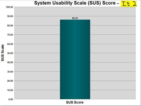
- Customer satisfaction (SUS) of the site's usability increased by 42%.
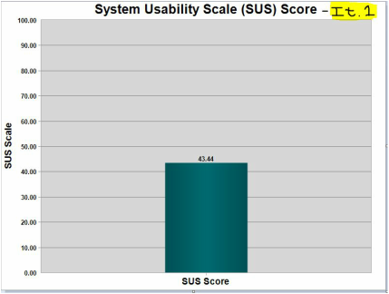
System Usability Score for Original and Improved Site-as rated by users.
|
|
BACKGROUND
- Product: Second Iteration
- Title: Teacher Resource Site
- User Type: High School Teachers (teaching Theology) in Private School
- Purpose of site: enable teachers to find, view, customize, print and save all documents pertaining to the course they would be teaching.
- Production time: (from concept to release): 2 months
- Key Cross-functional Collaborators: IT developer, Editorial Staff, Marketing Manager, Sales Manager, Visual Designer
- Organizational reasons for product: company was dedicated to having a place where teachers could go to find ALL documents related to each course they were teaching, whether the documents were found (in print) in the Teacher's Manual or not.
- My role in the project: assemble a team, guide the team in the data mining, UX work, and in holding fast to the vision throughout the development of the site.
THE PROBLEM
The teacher resource site was the "teacher side"' of a larger online learning environment envisioned to assist both students and teachers in both accessing and using their digital classroom resources. Though the teacher site was envisioned with functionality aimed at making their lives easier, users were finding it difficult to use in terms of how 1) it was organized 2) how elements were named and 3) the sheer amount of functionality.
The teacher resource site was the "teacher side"' of a larger online learning environment envisioned to assist both students and teachers in both accessing and using their digital classroom resources. Though the teacher site was envisioned with functionality aimed at making their lives easier, users were finding it difficult to use in terms of how 1) it was organized 2) how elements were named and 3) the sheer amount of functionality.
THE PROCESS
1. Conversations with the stakeholders helped us to sift through all of the functionality and flush out what functionality was "necessary" and what was "nice to have".
2. After identifying the KEY tasks that this site absolutely had to provide, we did a benchmark usability test (script to the right) to understand the current usability of the site with regard to the key user tasks.
3. The results of the test were insightful, not just because the scores for effectiveness, efficiency and satisfactory were way to low for something that would be used by thousands of teachers hourly during the day, but also because the talk aloud practice pointed to some very clear and specific disconnects between the mental models of our users and that which existed on the current site.
4. The team sat down and reinvisioned a simpler site, consisting of a) functionality specific to what the teachers absolutely needed to be able to do, b) changed the organization of the site to match what users were indicating they expected to see and c) changed the site terminology to match how users typically referenced the sections, menus, materials and the resources.
UX Research for Dance Studio Website:
Methods used: Site Analytics , Stakeholder Interviews, Question Design, Data Analysis, Usability Testing, Analysis & Reporting
THE RESULT:
1. Identified the Key User Tasks
2. Identified the Website's ability to address those tasks.
3. Delivered recommendations for improving:
1. Identified the Key User Tasks
2. Identified the Website's ability to address those tasks.
3. Delivered recommendations for improving:
- Content
- Content architexture
- Design
BACKGROUND:
- Product: Existing
- Title: Dance Studio Website
- User: new and existing students of dance
- Key Collaborators: Dance Studio owner, key dancer, receptionist
- My role in the project: determine the best research strategy for uncovering whether people were using the website and if so how it was working. Work with stakeholders to create interview questions and script for usability test.
THE PROBLEM:
Though her dance studio had been open for many years, the owner was increasingly aware that her students were opting to call the studio for everything from general information on pricing to actually signing up for class - even though all the information was available on the website. It wasn't clear whether her students just wanted to talk to someone OR if they were choosing to call because the site was too hard to use. Anecdotally, there were references to the latter.
Though her dance studio had been open for many years, the owner was increasingly aware that her students were opting to call the studio for everything from general information on pricing to actually signing up for class - even though all the information was available on the website. It wasn't clear whether her students just wanted to talk to someone OR if they were choosing to call because the site was too hard to use. Anecdotally, there were references to the latter.
THE PROCESS:
1. Site Analytics/Stakeholder interviews. First, I wanted to get a sense of what was currently happening on the web site, where people were going, clicking, visiting, how long they were staying....Secondly, I had conversations with the studio owner and a key dancer to get a sense of what they were hearing both on the phone and face to face, questions that were coming in, comments they heard as well as their own hypothesis of what was happening. From these 2 strategies, we had a sense of the questions that might help us identify what was happening.
2. User Interview Questions: We created a set of user interview questions (on the right) that we would ask students of the studio. The questions ranged from their background in dance and how they became connected to the studio to their process of taking classes and their use of the website. Our goal in having these different groups of questions was to see if we could identify when/where/why in their journey did they cross paths with the website.
3. Interview Training: we thought that having someone that the students knew do the interviewing would be the least disruptive method. So, I put together a mini "training" doc of things to keep in mind while doing this type of interview.
3. Upon analyzing the data from the dance student interviews, the stakeholder interviews and viewing online data analytics, it was clear there was common information students were trying to learn and common tasks they were hoping to accomplish, no matter at what point they were in their journey of dance.
4. We created a usability test plan (on the right) aimed at evaluating the sites ability to effectively, efficiently and satisfactorily address the previously identified key information. .
5. Results from the usability test showed that the information users were trying to find and the tasks students were trying to accomplish were too difficult based on the sites current navigation and organization.
6. Within the presentation to the client, recommendations were made related to: the content users were looking for, the structure they expected to encounter and what they did when they couldn't find what they needed.
Bringing products to life: Marketing & Advertising The Catholic Youth Bible
Methods used:
|
THE BACKGROUND
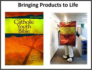
As the organization's cornerstone offering, The Catholic Youth Bible needed an "out of the box" and creative way to be reintroduced to it's beloved customers. The marketing team ran a few different ideas by the Bible, but in the end, The Catholic Youth Bible chose the idea that allowed it to have a "larger than life" and approachable presence that mirrored it's personableness and approachability inside. THE SOLUTION Introducing: The Bible Guy!. BTW, he loves to get his picture taken with customers. |
|
Planning On-Brand Customer Events:
Methods used:
|
THE BACKGROUND
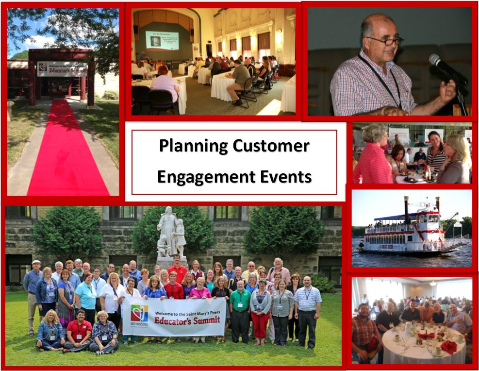
As the organization evolved, Saint Mary's Press looked for ways to engage with its customers in new ways, ways marked not by selling, but by being present to it's customers and helping them to learn and grow in a community-like environment. THE RESULT The Educator's Summit, now in it's 5th year, became a place for (customer) educators to experience professional development and personal renewal. But, it also became fertile ground which generated new product ideas, unfiltered product feedback, awareness of trends and pain points, an eager and collaborative customer base for testing out products, and a deep pool for expanding company talent. |
|